CapsimInbox User Interface Updates: A more clear and succinct onboarding experience
May 27, 2020
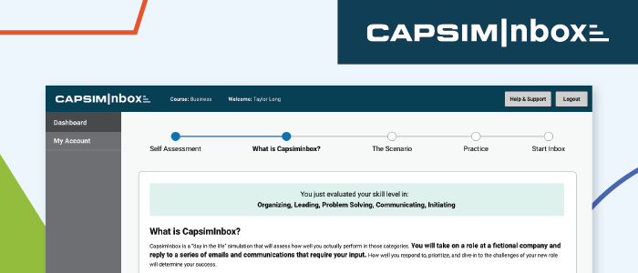
You may have noticed recent updates to the CapsimInbox user interface. We are constantly evaluating user feedback from both instructors and students to determine what enhancements we should focus on next. While overall, the general feedback for CapsimInbox has been outstanding, we noticed there were a few components in the onboarding process that needed clarification.
We studied survey feedback and made a few enhancements accordingly. The updates to CapsimInbox’s onboarding and interface were made to help students better understand the tool itself and also feel more immersed in the narrative.
Below we’ll take a look at how the new update will create an improved experience for you and your students.
Introduction to CapsimInbox
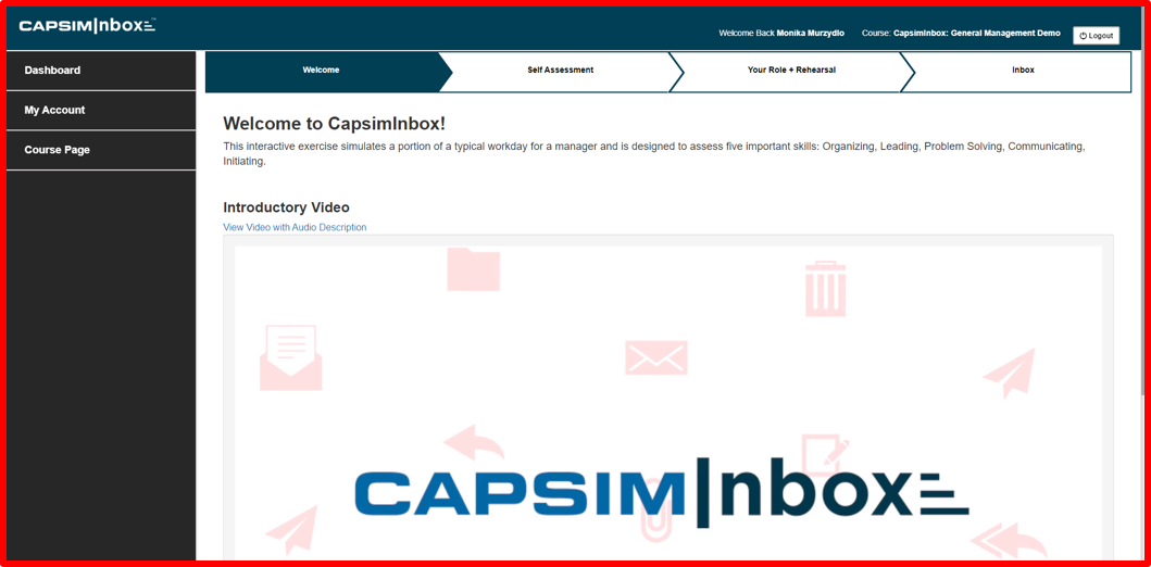
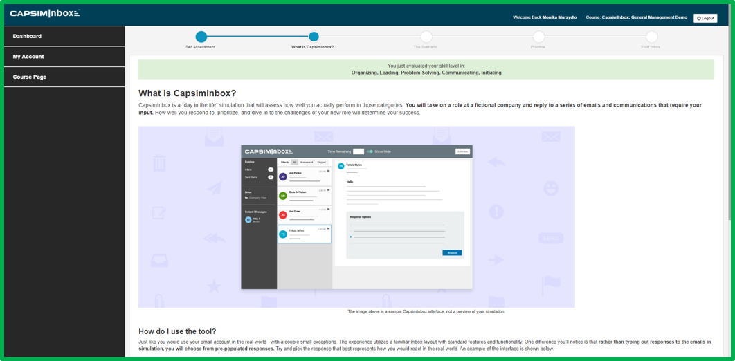
The ‘What is CapsimInbox?’ page provides students with information on how the assessment works, from answering emails and IMs to accessing company information in the File Drive. While the introductory video and information remain the same, we’re displaying a new and improved visual layout welcoming learners to their experience.
Immersing Students within the Narrative
Every CapsimInbox version introduces the students to a new fictional company, their fellow employees or contacts, and their new position. To help reiterate the narrative throughout the CapsimInbox experience, we made two updates:
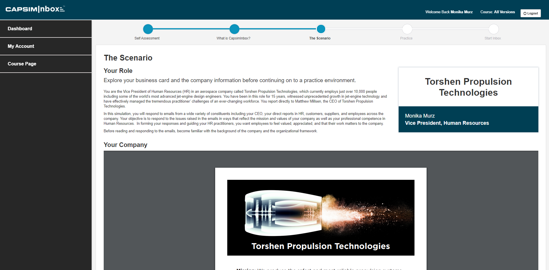
First we introduced a business card during the onboarding process that shows the student’s new position. Second, emails now include an email signature. Students will have an easier time understanding who each email is from and their role within each company.
Instant Messages (IMs)
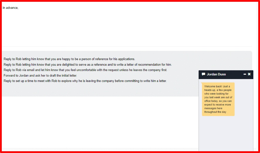
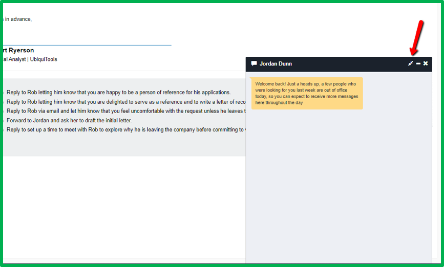
IMs can now be expanded, providing learners with an easier way to read longer messages.
Capsim always looks at feedback to advance our products. Stay tuned for future enhancements.
If you’re interested in using CapsimInbox in your next program, click the button below.


.png?width=80&name=1-questions%20(1).png)